Luxury Branding
Tactic
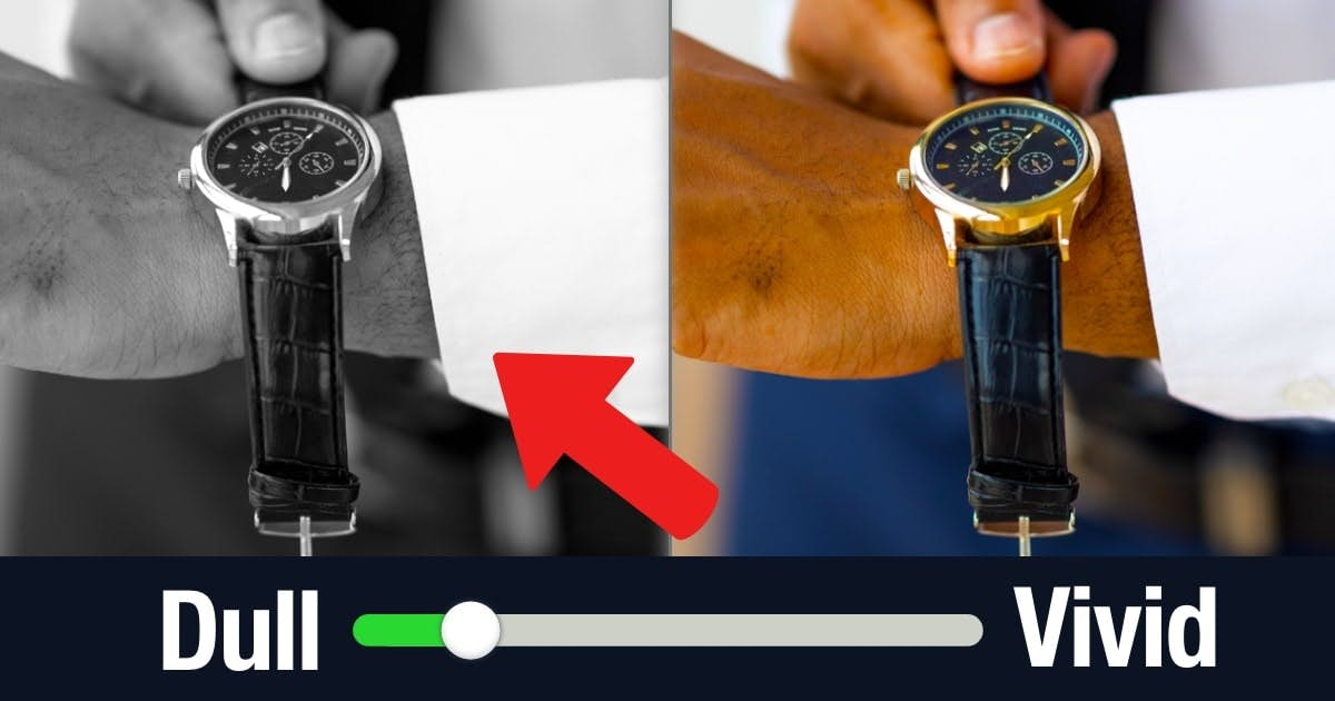
Reduce the Color Saturation of Luxury Brands
Grayscale seems luxurious.

Overview
We desire luxury products when standing further away because it feels like we can’t acquire them (Chu, Chang, & Lee, 2021).
Other research shows that your mental imagery is less colorful when you imagine a distant event (Lee, Fujita, Deng, & Unnava, 2017).
Compare those two findings:
- People prefer luxury brands with greater distance.
- Greater distance feels less colorful.
Therefore, shouldn't people should prefer luxury products with less color? Wouldn't these products feel more distant?
Indeed. In one study, a Tiffany watch seemed more luxurious in black-and-white (Wang, Wang, Mu, & Sun, 2022).
- Chu, X. Y., Chang, C. T., & Lee, A. Y. (2021). Values created from far and near: Influence of spatial distance on brand evaluation. Journal of Marketing, 85(6), 162-175.
- Lee, H., Fujita, K., Deng, X., & Unnava, H. R. (2017). The role of temporal distance on the color of future-directed imagery: A construal-level perspective. Journal of Consumer Research, 43(5), 707-725.
- Wang, Y., Wang, T., Mu, W., & Sun, Y. (2022). What is the glamor of black‐and‐white? The effect of color design on evaluations of luxury brand ads. Journal of Consumer Behaviour, 21(5), 973-986.
