Luxury Branding
Tactic
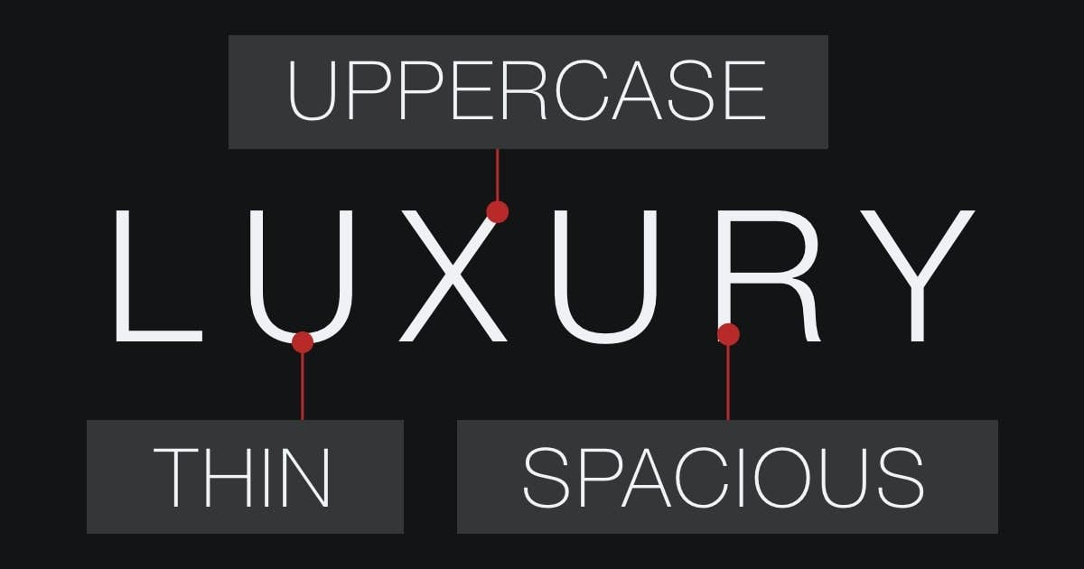
Luxury Fonts Are Thin, Spacious, and Uppercase
Just like the stereotype of the upper class, luxury fonts are tall, thin, and beautiful.

Overview
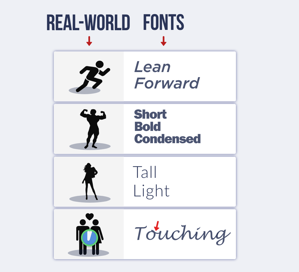
Fonts resemble traits from the real-world:

Luxury fonts should resemble the typical perception of upper class people – such as tall, thin, and beautiful. Something will “feel right” about these fonts.
Why spacious? Because products seem more valuable with more space (Sevilla & Townsend, 2016).
Why uppercase? Because brands seem more luxurious with uppercase letters (Yu, Zhou, Wang, & Wang, 2022). Lowercase fonts are too friendly and approachable (Teng, Xie, Liu, Wang, & Foti, 2021).
- Sevilla, J., & Townsend, C. (2016). The space-to-product ratio effect: How interstitial space influences product aesthetic appeal, store perceptions, and product preference. Journal of Marketing Research, 53(5), 665-681.
- Teng, L., Xie, C., Liu, T., Wang, F., & Foti, L. (2021). The effects of uppercase vs. lowercase letters on consumers’ perceptions and brand attitudes. Journal of Business Research, 136, 164-175.
- Yu, Y., Zhou, X., Wang, L., & Wang, Q. (2022). Uppercase premium effect: The role of brand letter case in brand premiumness. Journal of Retailing, 98(2), 335-355.
