Reduce the Font Size of Currency Symbols
Design currency symbols so they're less painful and easy to distinguish from the digits in a price.

Overview
Do you need a currency symbol?
Probably. It tells customers that a number is a price.
But in some contexts, removing this symbol can boost purchases because it reduces the pain of paying.
For example, an upscale restaurant in NY boosted their average order value by 8% from removing the currency symbol in their menu (Yang, Kimes, & Sessarego, 2009).
Maybe we can blame UX too.
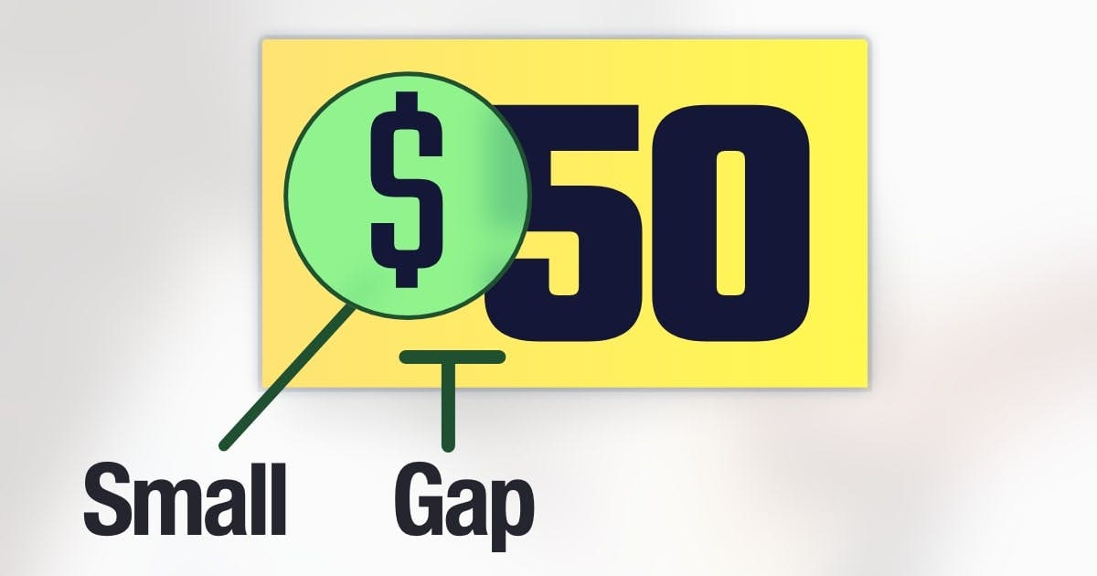
A currency symbol looks like a digit. Not only will the price “feel larger,” but customers need to disentangle this symbol to identify the true price.
You might need to adjust the size, color, or position of your currency symbol so that customers can easily separate it from the remaining digits.
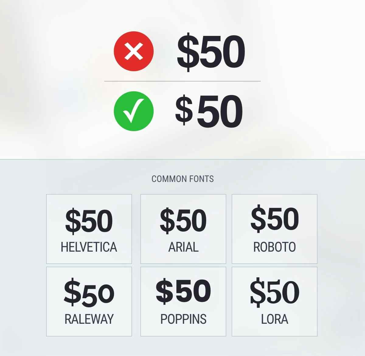
But it depends on the font. Here are default styles in various fonts:

Notice how the visual difference makes it easier to read the price.
And here's a real-world example from Walmart:

Notice how the dollar sign is smaller and further away.
- Yang, S. S., Kimes, S. E., & Sessarego, M. M. (2009). Menu price presentation influences on consumer purchase behavior in restaurants. International Journal of Hospitality Management, 28(1), 157-160.
