
Advertising
Tactic
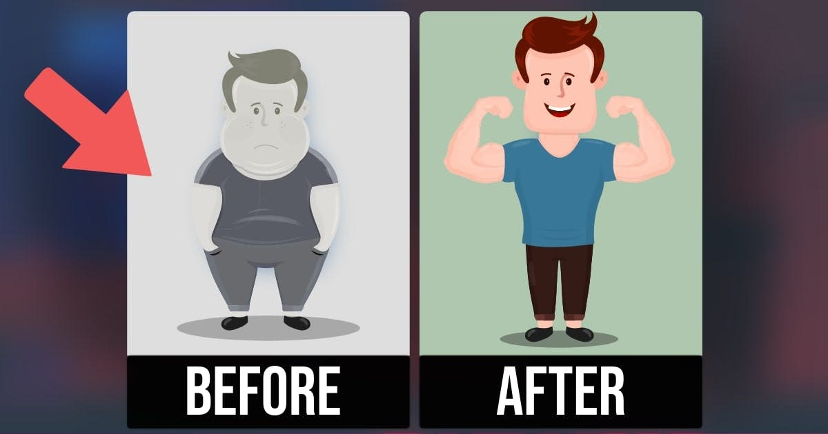
Depict the Problem in Grayscale
A visual difference implies a semantic difference.
Overview
Infomercials are notorious for this technique.
You see footage of somebody needlessly struggling with an ordinary task. Then bam. You see another person solving this problem with a better product.
But have you noticed that the “before” scenario is usually black and white? Advertisers want these two scenarios to look visually different. I call it contrast fluency. Viewers confuse visual contrast for semantic contrast: Hmm, something seems different. The product must make a big difference.
Therefore, degrade the color or visual quality of the “problem” framing.