Ecommerce
Tactic
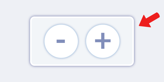
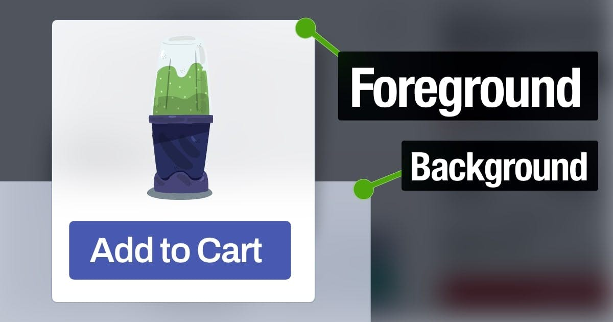
Bring Buttons to the Foreground
Buttons feel more clickable when they appear physically closer.
Overview
Customers evaluate purchase decisions by imagining the why and how — in other words, these two scenarios:
- Outcome: Consuming the product
- Process: Completing the transaction
Strengthening those two simulations will influence people to buy.
Buttons seem irrelevant to a purchase, but they comprise the second simulation. Customers are more likely to buy your products if they can imagine clicking the purchase button.
Some interfaces, like Apple, position the purchase button at the bottom of the screen. This location is closer to the user’s fingers, so they can imagine pressing this button more easily.
You can also bring buttons to the foreground by inserting something behind them (e.g., shadow, background).