
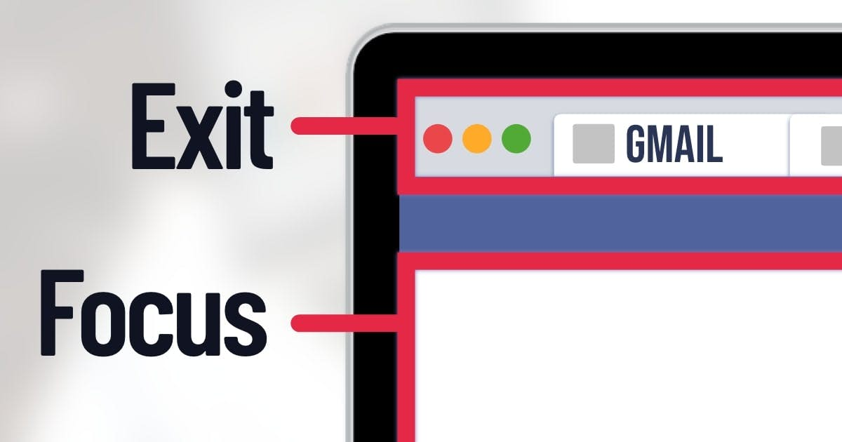
Darken the Top Border of the Interface
A dark border separates the exit tabs in the browser from the main interface.
Overview
White interfaces are good for actions (e.g., purchases).
But there’s a problem. Look at these rectangles:
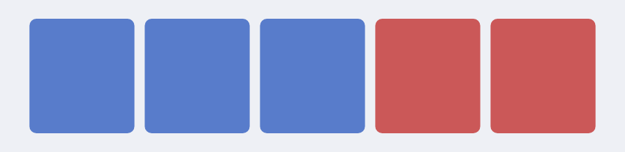
Thanks to the “gestalt” principles of similarity, your brain sees two clusters of squares.
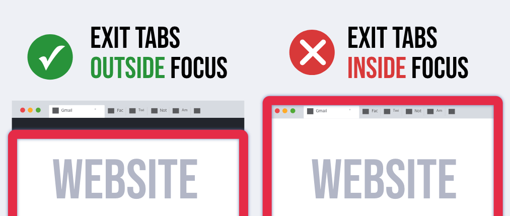
The same effect occurs with tabs in your browser. Look at your tabs right now. What color are they? They’re usually white or grey.
But if your website has a white background, then visitors will group your website with those tabs.
And that’s bad.
If visitors click one of those tabs, they will leave your website. You need to push those tabs outside of their attention.
Perhaps designers could darken the top border of the interface. This dark bar becomes a conceptual bar that keeps their attention fixated on the website. Visitors will be less likely to click a tab (and leave your website).
Caveat: It depends on the browser. Dark tabs would need the opposite color (e.g., white border at the top).